Musings

Reflections on life, work, and whatever gets me thinking

On Sit-Ups and Data Analysis

Musing #001

I started going to the gym, and the place I go to launched a challenge: whoever does the most sit-ups without stopping wins fitness product prizes.

The fun part is they put up a board with everyone's results. Since I've been studying Python, I decided (after transcribing all 27 entries into Excel) to analyze the dataset. Here are the main findings:

The first thing I noticed on the board was the max value: 1,110 sit-ups. A jiu-jitsu instructor did that gigantic number in 45 minutes without stopping. After removing that outlier, I calculated the mode, median, and mean: 30, 75, and 111, respectively.

That already tells us it's a right-skewed distribution, with more values on the lower end, because, well, it's a lot easier to find people (like me) doing 30 sit-ups than the 1,100 the instructor did. To wrap it up, I made this boxplot. I use this chart in Excel all the time to analyze ship transit time, but in Python it's a lot more "aesthetic."

So there it is, the gym finally served a purpose.

Chart showing the distribution of sit-up counts
Sit-Ups Are Complex

On Running and the Outlier That Wasn't an Error

Musing #002

I ran my running data through an AI just to play around. Didn't expect to walk away with a reflection on data analysis. (yes, I know this sounds exactly like every LinkedIn post, but honestly, the example that came out of it was too good not to share)

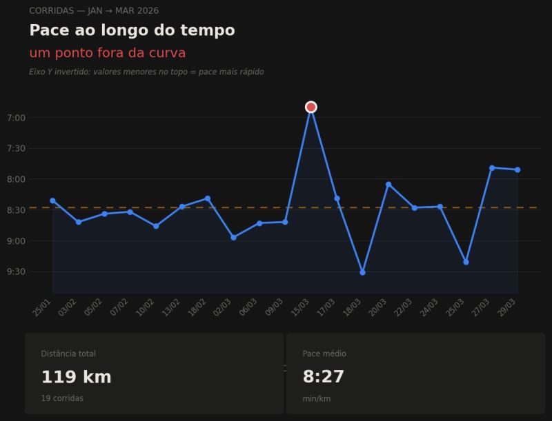
I exported my Garmin history and asked it to analyze my pace over time. The chart came out clean. Steady curve, subtle improvement.

Then it flagged a point outside the curve. March 15th. Pace of 6:50/km, the best in the series. Heart rate of 177 bpm, the highest of all. Diagnosis: possible outlier, could skew the analysis.

It was right, given what it had to work with.

What it didn't know: that day was my 5K time trial. The goal of months training 3x a week since September. My previous time was 34:50. That day I ran 34:12.

It wasn't an error in the data. It was the most important data point of all.

It's easier to see the problem once you swap the AI for an analyst who only got the chart, never talked to the team, never knew what that spike represented. The conclusion would be the same: strip the outlier, ship the clean report, tell the wrong story.

Data without context is noise. And sometimes the outlier is the result.

Pace-over-time chart with the March 15th outlier highlighted
Outlier Is The Result

A Metric That Looked Fine While Hiding a Real Problem

Musing #003

A metric doesn't have to be wrong to conceal a problem.

At a large manufacturer I worked for, the import team relied on one number: landed cost factor, the total cost to import a product, divided by the product's value. It's the metric supply chain uses to determine whether freight contracts are effective.

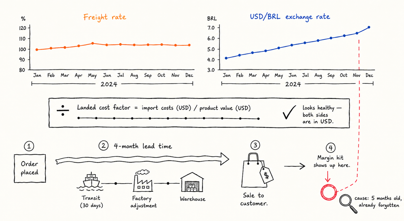
For a period in 2024, international freight rates kept increasing. Some products, the ones with the least predictable demand, absorbed the full impact. But across the company, the average remained stable. Contracts, negotiation, mix: the factor stayed healthy. Nothing alarming on the dashboard.

Meanwhile, the business units, my internal clients, were watching margin erode, and were quick to blame the obvious suspect: "freight's too expensive, you're just not negotiating hard enough."

I isolated the outliers and reviewed them with the cost team. Freight had barely moved the factor. What had moved, substantially, throughout that year, was the exchange rate.

Here's the nuance that's easy to overlook. That factor is a dollar-over-dollar ratio: FOB, freight, everything on the import side is priced in dollars. When the exchange rate surges, the ratio remains unaffected, because both sides of the division move together. The metric is constructed to be insensitive to currency movement, by design.

What it also fails to capture is the four months between placing an order and that product's impact materializing in a customer's margin: transit, factory adjustment, warehouse time, the sale itself. Prices hadn't been repriced for that window's exchange rate. By the time the impact was visible on the sales side, the currency movement responsible for it was five months old, already forgotten.

The freight number wasn't inaccurate. It just wasn't constructed to detect what was actually happening.

Diagram showing freight staying flat while the exchange rate spikes, with the 4-month lag to margin impact
Metric Wasn't Lying
Live KPIs
0:00 Time on Site
1 Pages
0% Scroll
0 Engagement